University of Michigan Student Football Ticket Mobile Application
Role: UX/UI Designer
Team: Individual IOS Project
Timeline: September - October 2018

Project Background
Overview
For a personal project, I developed a mobile ticket application for University of Michigan students to replace the current paper football ticket system.
Problem Statement
University of Michigan students need a way to store, sell, and buy student football tickets so they feel less stressed about losing their tickets before the game and have an easier time purchasing and selling their unused student tickets.
Context
Over the past three years, I’ve come to observe certain consistent behavior among students during football season. Students are constantly posting about buying and selling tickets on social platforms, especially before big games. Some of my friends who did not purchase season tickets constantly complain about not being able to find tickets, and also mention how students up-charge prices from the base-value of $25. Their frustrations triggered me to think of an application like StubHub and Ticket Master specific for University of Michigan students.
Research Phase
Social Listening
I first utilized social listening tools to discover if there was noticeable evidence of students inquiring about tickets during football season. I noticed an abundance of students posting about buying tickets in addition selling them, even on the day of the scheduled game.


User Interviews
I then conducted user interviews with peers and classmates to learn more about students’ unique football experiences. Some of the questions I asked included:
Tell me about the last time you bought or sold a Football Ticket.
Could you describe where you would look to find or sell Football tickets and why you chose that place?
Can you tell me about a time when you had difficulty with the process of selling or buying Football tickets?
How do you pay a student or ask to be paid during a ticket transaction?
Tell me about a time, if applicable, when you faced a challenge attending a football game?
What features would you most like to see on a Michigan Football application?
MAIN INSIGHTS

I was surprised by the stories I heard: one person bought two student tickets for himself and visitor, but the seller showed up with a ripped, invalid ticket and refused to Venmo him back (see messages below).
Another student attempted to buy a Michigan State ticket by posting in FB groups, yet with such a high demand, the lowest price she could find was $100. Another peer walked to the Big House only to realize she forgot her M-Card in her dorm (unique ID needed to enter the stadium); another student lost his ticket dancing at a tailgate; another student failed to sell her ticket the day of the game after deciding pizza sounded more appealing than football.
It was clear that my friends were not the only students facing problems with the current ticket system.
Personas
As there are many different types of Michigan fans, I created three personas and scenarios to better understand who I was designing for and the different ways the app could be implemented.
Design Phase
Design Requirements
After creating these personas, I was able to establish design requirements:
Enable users to sell student tickets.
Allow users to access their student tickets and scan them at the game to enter the stadium.
Enable users to buy student tickets with a map of the stadium.
User Flow
I first sketched out the basic user flow with my primary student audience in mind. I produced this map based off the suggestions of features and functions from interviews, including storing, selling, and buying tickets.

Inspiration
Before I brought my wireframe to life, I investigated popular mobile ticket applications to find inspiration for simple layouts that users already understand and are familiar with. After analyzing how StubHub & Ticket Master execute their ticket feature, I wanted to emulate the simple, event listing and buying formats into my application.

StubHub & Ticket Master Inspiration
Low-Fidelity Wireframes
I then utilized sketch to create basic wireframes for the core functions:

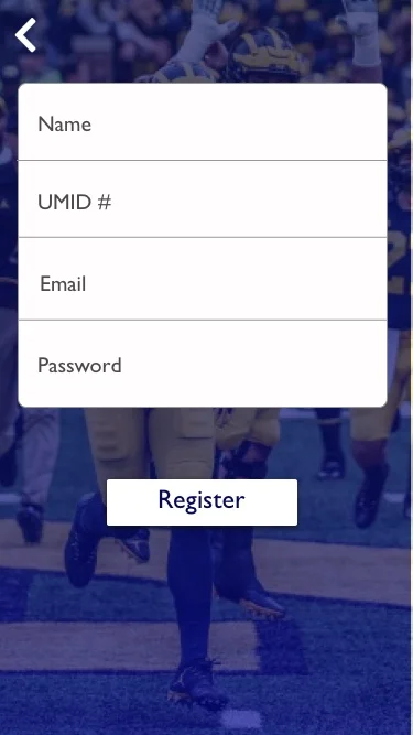
High-Fidelity Wireframes
I explored Michigan’s official color scheme and conventional Michigan apps to ensure my ticket design was realistic and would fit University standards. Incorporating pre-established U-M colors and fonts was a solution to meet the requirements of stakeholders, specifically U-M administration, as they would expect an app to fit the established Michigan theme.

I also analyzed the Apple Wallet iPhone application and reproduced the present paper football ticket, which greatly influenced the layout and design of the My Tickets screen.


Aiming to successfully fulfill utility requirements while simultaneously keeping the design simple, here’s what I first came up with:


Iteration
I tested this initial design with classmates and asked them to complete my main user tasks (selling a ticket, buying a ticket, and showing your ticket at the stadium). I did not provide directions or help when they attempted to complete each task in order to receive unbiased feedback. I encouraged them to speak aloud and share their thoughts when they navigated through the app, and asked specific questions about how they felt about the design and process at the end of each task. Here’s what I found out through this critique:
Points of friction:
1. People did not intuitively understand the 79 tickets available button. Also, since the home page offered a way to navigate to the Buy screen directly, they recommended that it should also offer a button to navigate directly to the Sell screen.

2. Users did not know what they would realistically type on the Search screen. Some mentioned that the screen wasn’t necessary and acted as a distraction because it delayed them from accomplishing the main tasks.

3. Many questioned why the Sell and Buy screens had different layouts.

User suggestions
One peer suggested that students should log into the app with their Michigan ID. This log-in feature would likely decrease the time it takes to enter the stadium as students would not have to present their M-Card ID at the stadium. It would also alleviate the stress of remembering to bring it to the game.
Another student recommended to include price and section filters for the ticket map screen. He also mentioned to highlight only the student section on the map.
Another student proposed to lighten the gradient at the top of each screen.
Modifications
Confident in the changes I needed to complete based on this feedback, I iterated on my app, removing old screens while also creating new ones.
Added buy/sell functions to the app’s main screen.
Removed the search screen.
Added (+) buttons to make it more clear that users should click on each game in order to perform a specific behavior.
Combined my initial layout for selling and buying into one design to make it consistent across screens.
Created an on-boarding process that required a UMich ID.
Created a pricing process after deciding to sell your ticket.
Added the ability to add credit cards and Venmo as payment methods because during interviews, users stated they like trustworthy, digital, cash free transactions.


I was satisfied with the app’s usability component, but decided to further iterate on my high fidelity wireframes with a focus on design. After hearing a Michigan graduate speak about his technology and design experiences during one of my classes, I reached out him for feedback. Based off his critique, here’s what I changed:
Switched the long-in and log-out button color from white to yellow in order to differentiate these from the white background and other buttons.
Added a function description of the application.
Removed the blue (+) circles on the sell and buy ticket.
Increased the font size of the sections on the Michigan map.
Check out my InVision prototype and updated screens!

Reflection Phase
Key Takeaways
I now recognize the importance of consistency. Whether it was the slight change of adding both buying and selling functions on the home screen or keeping the layouts similar on these screens, I realized that consistency results in a smoother process for the user, which is a design element I will focus on and apply to my future projects.
I also learned the important of UX research. Identifying the true needs of people’s problems is a critical step to designing, which I experienced first-hand as my interviews and questions led me to incorporate the digital ticket into my application.
Challenges
As this was my first time using sketch, I had to watch multiple tutorials numerous times and spent hours becoming familiar with the platform and its tools. I made mistakes in exporting my screens (seen in my low fidelity wireframe map screen), but quickly learned the ins and outs of the program. I am excited to continue exploring different attributes on Sketch that I will be able to utilize in my future projects.
Edge Cases
When designing and talking to peers, I discovered potential problems that may prevent people from using this application:
What if my phone dies? Technology is great! But unfortunately, portable technology often has to be charged. If students’ phones die, how will they access their ticket? A future solution to this issue would be adding the ability to print tickets from their mobile device or having the capability to log into their account using a friend’s phone. However, even though a dying phone is a problem, this hinderance may encourage students to refrain from being on their phone while tailgating before the game in an attempt to save battery. This setback may actually be more positive, as it would urge students to stay in the present moment instead of using their phones while celebrating Michigan before the game. Because of this challenge, I realized that in all of the problems I attempt to solve, I want to utilize the power of technology to foster connections and human interaction, which will be the underlying motivation in my work going forward.
What if I’m not a Michigan student? Non U-of-M students have to validate student tickets to enter the stadium. Thus, with this current application, students would not be able to buy tickets for their visitors. A solution would be to implement a guest sign in that any non-U-of-M user would be able utilize, which would be connected to the current validation system.
Going Forward
Throughout the design process, I kept note of other features that could be implemented in future versions based on my own ideas and suggestions from peers:
A “find my friends” feature for the stadium, where students can see the exact location of their friends to make it easier to meet up in specific sections, especially since there is bad cell service in the stadium.
A live updates component, whether this includes weather alerts, scores, and game delays. One user I interviewed showed up to a game not realizing there was an hour weather delay.
A section to read about players and their bios.
A message system where you can converse with sellers and buyers.
I was inspired to create a medium I was not only passionate about, but one that would tangibly benefit the people who share the same pride and appreciation as me for my team and school. Based on candid feedback during user testing and surveys, I believe it would quickly be adapted by the Michigan community. Thanks for reading—and as always, GO BLUE!
