Swift - DMV Application
Role: UX Researcher; UX/UI Designer
Team: Danielle Roberts, Danielle Gogick, Ella Jomo, Mckinley Schmidt
Timeline: September - December 2019
Project Background
For a class project, teams were tasked to develop a technology used to “strengthen social fabric” based on a CHI Design Student Challenge. I was assigned to a random group with four other students to work on this project for a full semester.
My team!
Problem statement
The Department of Motor Vehicles visitors (our main users) need an improved way to gain access to wait times and pre-register for specific actions so clients and staff feel less anxious about spending unnecessary hours at the DMV.
The DMV is inefficient with…
What are the problems with the existing online services?
Research
Comparative analysis
Purpose
We analyzed analogous competitors as they have efficient systems that enable users to quickly receive important information regarding wait times and reservation activity.
RESY & OPEN TABLE
Personas & scenarios
Purpose
We crafted personas and scenarios of our sample users for our design to be emblematic of the DMV users we are targeting. With limited time, we were not able to talk to as many potential users, so making personas encouraged us to think about specific, real situations that our target audience would be in when they went to the DMV.
PERSONAS
SCENARIOS
Storyboarding
Purpose
We developed two storyboards based on our scenarios to better visualize how users would progress through certain tasks.
Design time!
User flow
Organized information architecture and hierarchy to have a clear direction and organizational structure for low-fidelity sketches.
Group sketches
Individually brainstormed and sketched out main features of our application to explore potential ideas and creative approaches.


Low fidelity wireframes
Designed low-fidelity wireframes using FIGMA after analyzing our sketches and combining our ideas.
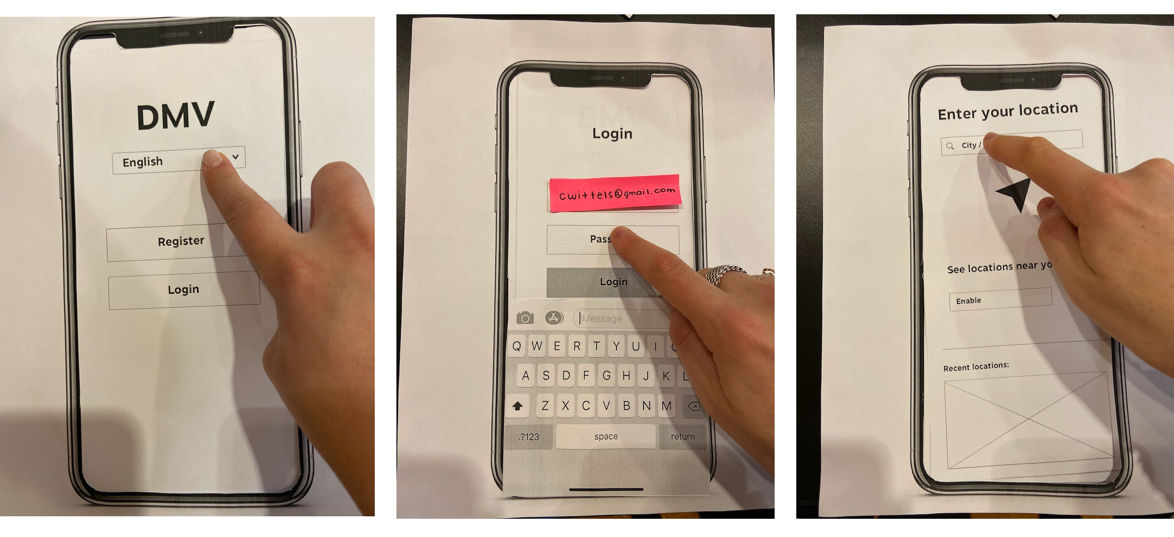
Paper prototype usability testing
Purpose
We conducted three paper prototype tests with defect logs for each test that informed changes to the design of our app.


Main findings:
Users questioned if it was required that they make an account.
Users demonstrated significant hesitation when using the menu sidebar and returning back to screens.
One user mentioned that he desired more confirmation indicators.
Users were confused by the location page.
Design iteration
UI Design exploration
High-fidelity prototype
After discussing different approaches and UI decisions, we decided to iterate on our high fidelity screens, utilizing a simple color scheme that was already incorporated in DMV systems. We lightened up the screen by removing the black navigation bar. With our users in mind, we strived to create an experience with distinct buttons, evident text, and general UI elements and features that intuitively guide users through specific actions.
Reflection Phase
Key Takeaways
Test early and often! Paper prototyping enabled us to find gaps in our app early on in the design process.
Everyone on my team started with different design skillsets and expertise. It was a great experience learning how to effectively teach design tools to my team while actively listening to their feedback and suggestions. These interactions exemplified the value in collaboration as my group was able to efficiently contribute to the final prototype at the end of the project.
Going Forward
If we had more time, we would have liked to do additional generative research and testing by sitting in at real DMV sites to validate our assumptions.
During the early stages of our design process, we wanted to add a feature to our app specifically for DMV employees. This would allow employees to review documents (i.e. social security, proof of insurance/residence, etc.) that users scan and submit on the app prior to their visit, with the interest of increasing efficiency even more by cutting out a step at the DMV. We narrowed the scope of our project, thus this feature could potentially implemented in our next steps depending on feedback from users.


